Wednesday, April 6, 2011

Extend the functionality of WPF Control using Custom Control


Here, we will learn how to extend the functionality of existing WPF control. This will help you in that situation when you want to create a control with new style and design but don’t want to write basic properties of that control like “IsSelected”, “SelectedItem” for TabControl  and “Content” of Button etc.
To achieve this, you have to follow these steps and finally you'll get your own Custom Control with new “Name” and “Style” which inherits all the basic properties of that WPF Control.
Note: You can extend any WPF Control with these steps, but here I am taking a simple example of “Button” Control for better and quick explanation.
I am hoping that, you know what is Custom Control? And how we create simple Custom Control using Dependency and Attached Properties?

1. First add “Custom Control” and name it “ButtonExtendControl.cs”.


2. When we open “ButtonExtendControl.cs” file, we'll find the class inherited with “Control” which is a base class for all WPF Controls.
public class ButtonExtendControl : Control

Now what we will do, instead of inheriting with “Control” inherit it with that Control from which we want to extend our Custom Control (like Button, Combobox, TabControl, Checkbox, etc.). Here we are extending our Custom Control with “Button” that’s why we inherited it with “Button” class like this:
       public class ButtonExtendControl : Button

3. Now extract the Style and Template using expression blend of that control from which we want to extend our Custom Control. Here we extract the Style and Template of “Button” like this:
Steps: Right click on Button Control --- Edit Template --- Edit a Copy


You'll get the “Style” with all “Setters” and “Templates” in the code behind page of expression blend.

4. Now copy contains of “ControlTemplate” and paste into the “ControlTemplate” of ButtonExtendControl style which is in “Generic.xaml”. Do the same for all setter properties and paste into the style like this


5. Now when we call “ButtonExtendControl” in “MainWindow.xaml” using below code, it looks like same as WPF Button. Because we just copy paste the Style and Template in our new custom control, we didn’t make changes it the style or template.

local:ButtonExtendControl Content="Custom Button" Width="200" Height="40"

6. Now we edit the “ControlTemplate” and add one Dependency Property (“ButtonCornerRadius”) in our Custom Control ("ButtonExtendControl").
To edit ControlTemplate we'll replace the tag Microsoft_Windows_Themes:ButtonChrome with the “Border” like this:
Here we are setting one dependency property (which is an additional functionality for the "Button" Control), so that user can set the corner radius according to their desire and change the shape of button like rectangle, rounded, oval or circle.
CornerRadius="{Binding ButtonCornerRadius, RelativeSource={RelativeSource AncestorType={x:Type Button}}}"
 
In “ButtonExtendControl.cs” we write this code for dependency property, default value for this dependency property is zero.
public double ButtonCornerRadius
 {
  get { return (double)GetValue(ButtonCornerRadiusProperty); }
  set { SetValue(ButtonCornerRadiusProperty, value); }
 }

public static readonly DependencyProperty ButtonCornerRadiusProperty =
      DependencyProperty.Register("ButtonCornerRadius", typeof(double),
      typeof(ButtonCustomControl), new UIPropertyMetadata(0.0));


Note: Most important thing is how to set dependency property.
 
If we'll use “TemplateBinding” or “Binding” keyword for CornerRadius, It'll not work because we are extending our custom control with another control.

Thats why, we use RelativeSource so that we enforce the binding to take value of ButtonCornerRadius from ButtonExtendControl class which is basically of Button type.
CornerRadius="{Binding ButtonCornerRadius, RelativeSource={RelativeSource AncestorType={x:Type Button}}}"


Now see how the developer can change the shape of this Custom Control by just changing the value of ButtonCornerRadius property.

Rectangle Shape
local:ButtonExtendControl Content="Custom Button" Width="200" Height="40" ButtonCornerRadius="0"


Rounded Shape
local:ButtonExtendControl Content="Custom Button" Width="200" Height="40" ButtonCornerRadius="20"


Circle Shape
local
:ButtonExtendControl Content="Custom Button" Width="100" Height="100" ButtonCornerRadius="50"


Here is the code sample for better understanding.

Thanks
Hope this will help you.

Monday, August 31, 2009

Creating Signed Access Signature in Azure Storage

Introducing Signed Access Signature
In this blob we are going to discuss about Signed Access Signature, which is a new feature of “Window Azure” to provide access rights to containers and blobs at a more granular level than by simply setting a container’s ACL for public access.

What is the need of Signed Access Signature?
Windows Azure storage operates with “shared key authentication.” In other words, there’s a password for your entire storage account, and anyone who has that password essentially owns the account. It’s an all-or-nothing permission model. That means you can never give out your shared key. The only exception to the all-or-nothing rule is that blob containers can be marked public, in which case anyone may read what’s inside the container (but not write to it).

What is Signed Access Signature?
Shared Access Signature, you can grant users access to a specific blob or to the blobs within a container for a specified period of time. You can also specify what operations a user may perform on a blob that's accessible via a Shared Access Signature.
Supported operations include:
· Reading and writing blob content, block lists, properties, and metadata
· Deleting a blob
· Listing the blobs within a container

A Shared Access Signature is a set of URL query parameters that incorporates all of the information necessary to grant controlled access to a blob or container resource. The URL specifies the time interval over which the Shared Access Signature is valid, the permissions that it grants, the resource that is to be made available, and the signature that the Blob service should use to authenticate the request.

Additionally, the URL for the Shared Access Signature may reference a container-level access policy that provides an additional level of control over a set of signatures, including the ability to modify or revoke access to the resource if necessary.


Constructing the Shared Access Signature URL
http://myaccount.blob.core.windows.net/myContainer/MyBlob?st=2009-02-09&se=2009-02-10&sr=c&sp=r&si=YWJjZGVmZw%3d%3d&sig= dD80ihBh5jfNpymO5Hg1IdiJIEvHcJpCMiCMnN%2fRnbI%3d

Here:
st(signedstart) = Optional. The time at which the Shared Access Signature becomes valid. The time must be specified in a valid ISO 8061 format. If you omit the start time, the interval begins immediately.

se(signedend) =Required. The time at which the Shared Access Signature becomes invalid. The time must be specified in a valid ISO 8061 format. This field may be omitted if it has been specified as part of a container-level access policy (or in other way we can say that, se(signedend) may be omitted if (si)signedidentifier is assigned in the URL).

sp(signedpermission) = Required. The permissions associated with the Shared Access Signature. The user is restricted to operations allowed by the permissions. Valid permissions values are read (r), write (w), delete (d) and list (l). This field may also be omitted if it has been specified as part of a container-level access policy (or in other way we can say that, sp(signedpermission) may be omitted if (si)signedidentifier is assigned in the URL).

Note: r, w, l, d always comes in “rwld” sequence. These are some invalid permission like, wr, lr…etc.

sr(signedresource) =
1. Specify b to designate access scope to the content and metadata of a specific blob in the container.
2. Specify c to designate access scope to the content and metadata of any blob in the
container, and to the list of blobs in the container.

si(signedidentifire) = Optional. A unique value that correlates to an access policy specified at the container level. The signed identifier may have a maximum size of 64 bytes.

If a signed identifier is not specified as part of the Shared Access Signature, the maximum interval over which the signature is valid is one hour, and you have to specify signedend and signedpermission in the URL as well as in the string-to-sign.

If a signed identifier is specified as part of the Shared Access Signature, the maximum interval over which the signature is valid is depend on the start and expiry parameter of the container access policy.

If you defined all parameters in container access policy then you have no need to define again in the URL as well as in string-to-sign. But those parameters which u doesn’t define in container access policy are required to define in the URL as well as in the string-to-sign.

Example: - Suppose in container access policy you define ExpiryTime and Permission parameters. Then in the URL you are required to define only starttime parameter.

sig(signature) = The string-to-sign is a unique string constructed from the fields that must be verified in order to authenticate the request. The signature is an HMAC computed over the string-to-sign and key by using the SHA256 algorithm, and then encoded by using Base64 encoding.

Constructing the Signature String
To construct the signature string, first construct the string-to-sign from the fields comprising the request, then encode the string as UTF-8 and compute the signature using the HMAC-SHA256 algorithm.

Note that fields included in the string-to-sign must be URL-decoded.

To construct the string-to-sign, use the following format:

StringToSign = signedpermissions + "\n"
signedstart + "\n"
signedexpiry + "\n"
canonicalizedresource + "\n"
signedidentifier

Note:
1
. If a field is optional and not provided as part of the request, specify an empty string for that field. Be sure to include the newline character (\n) after the empty string.

2. If the signed resource is a container:
URL = http://myaccount.blob.core.windows.net/music
canonicalizedresource = "/myaccount/music"

3. If the signed resource is a blob:
URL = http://myaccount.blob.core.windows.net/music/intro.mp3
canonicalizedresource = "/myaccount/music/intro.mp3"

4. signedidentifier is optinal, If you are omitting si(signedidentifire) from the URL then you have no need to define signedidentifier in the string-to-sign string.


Some Example how to create Signed Access Signature(SAS) and StringToSign:

Example without Signed Identifer:
1
. If you want to define all parameters in string-to-sign then your SAS and StringToSign is like this:
StringToSign = signedpermissions + "\n"
“signedstart” + "\n"
signedexpiry + "\n"
"/myaccount/mycontainer/myblob” + "\n"
“”
URL=http://myaccount.blob.core.windows.net/myContainer/MyBlob?st=2009-02-10&se=2009-02-10&sr=b&sp=r&sig=dD80ihBh5jfNpymO5Hg1IdiJIEvHcJpCMiCMnN%2fRnbI%3d

2. If you don’t want to give Start Time and then your SAS and StringToSign is like this:
StringToSign = signedpermissions + "\n"
“” + "\n"
signedexpiry + "\n"
"/myaccount/mycontainer/myblob” + "\n"
“”
URL=http://myaccount.blob.core.windows.net/myContainer/MyBlob?se=2009-02-10&sr=b&sp=r&sig=dD80ihBh5jfNpymO5Hg1IdiJIEvHcJpCMiCMnN%2fRnbI%3d

Example with Signed Identifer:
1
. If you give si(signedidentifire) and others parameters are define in container access policy then your SAS and StringToSign is like this:
StringToSign = “” + "\n"
“” + "\n"
“” + "\n"
"/myaccount/mycontainer/myblob” + "\n"
“signedidentifire”

URL=http://myaccount.blob.core.windows.net/myContainer/MyBlob?sr=b&si=YWJjZGVmZw==&sig=dD80ihBh5jfNpymO5Hg1IdiJIEvHcJpCMiCMnN%2fRnbI%3d

2. If you give si(signedidentifire) and only permission parameter is define in container access policy then your SAS and StringToSign is like this:
StringToSign = “” + "\n"
“signedstart” + "\n"
“signedend” + "\n"
"/myaccount/mycontainer/myblob” + "\n"
“signedidentifire”

URL=http://myaccount.blob.core.windows.net/myContainer/MyBlob?st=2009-02-10&se=2009-02-10&sr=b&si=YWJjZGVmZw==&sig= dD80ihBh5jfNpymO5Hg1IdiJIEvHcJpCMiCMnN%2fRnbI%3d

Friday, July 3, 2009

How to focus a UserControl on a Key Event in WPF Application

If you want Key Board functionality in your application then this will help you definitely.

If you want focus at the time of creating User Control in WPF application, so that if user trying to use key board functionality directly for shortcuts without touching or focusing the User Control by mouse.......then you have to do these two things.

1. Write this.Loaded += new RoutedEventHandler(UserControl_Loaded) in Contructor.
2. And set these two property in "UserControl_Loaded" function
this.Focusable = true;
this.Focus();


After that, when you run your application you get directly focus on User Control without focusing by mouse and you can use your keyboard for Shortcuts.

Friday, April 24, 2009

Creating a Custom Scroll Viewer Template in XAML using Expression Blend

In this post I will demonstrate how to Create a Custom Scroll Viewer Template for a Silverlight or WPF application in XAML using Expression Blend.

First, Create a WPF application, your Solution Explorer will look like this,


Select Scroll Viewer from Tool Bar and drag it into Grid


In the Objects and Timeline panel, click the [ScrollViewer] item to select it and edit a copy of Scroll Viewer by selecting “Edit a Copy”.


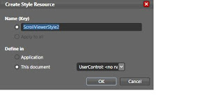
Click OK to Create Style Resource


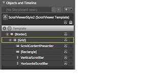
Now Objects and Timeline panel look like this,


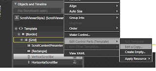
In Objects and Timeline panel, click VerticalScrollBar and edit it by selecting “Edit a Copy”.


Click OK to Create Style Resource


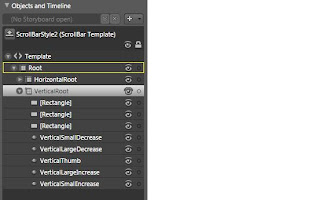
After creating Style Resource your Objects and Timeline panel look like this


Select first items [Rectangle] from Objects and Timeline panel and then go to Properties panel by clicking on its tab in the Solution Explorer and change BackGround of the [Rectangle] to Grey.
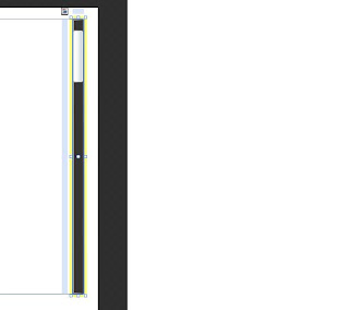
After changing properties Scroll Viewer will look like this,


VerticalRoot item have 7 children. We have to edit these children to make changes in Vertical Scroll Viewer Template.


First select VerticalSmallDecrease items from Objects and Timeline panel and select edit template by selecting “Edit Template


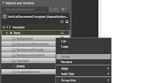
Then delete all items from Objects and Timeline panel except [Path] ,


After deleting, select [Path] and change background from Properties panel by clicking on its tab in the Solution Explorer.


You can change the behavior of [Path] on different state like MouseOver, Pressed and Normal from States Panel.


Come back to VerticalSmallDecrese items using this tab which is on top of your screen,


And do the same for VerticalSmallIncrease.


Now we will change VerticalThumb and edit it by selecting “Edit Template” from Objects and Timeline panel and delete all items except Background like this,


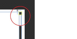
After deleting items your Vertical Scroll Bar look like this,


Now change the background and other properties like Margin, Thickness of the [Background] from Properties panel by clicking on its tab in the Solution Explorer.


Finally your Vertical Scroll Viewer looks like this.


I hope this will help you in building your own beautiful and fancy Custom Scroll Viewer Templates.


Thanks
Shrey Chouhan

Wednesday, February 4, 2009

Little tidbits about Silverlight 2.0

Hii, I am Shrey Chouhan. This is my first blog.

Lets share my coding experience with you.

If you are developing a page in Silverlight 2.0 and want to change Grid Background color dynamically then follow these steps.

In your XAML page, first create GRID and named it "gridColor".

And then write these lines in code behind page

LinearGradientBrush lb = new LinearGradientBrush();
GradientStop gs = new GradientStop();
gs.Color = Colors.Brown; // Set the color
lb.GradientStops.Add(gs);
gridColor.SetValue(BackgroundProperty, lb);


And finally you do that....

Similary, you can change background (color) of any other control also.

Thanks...

Shrey Chouhan